
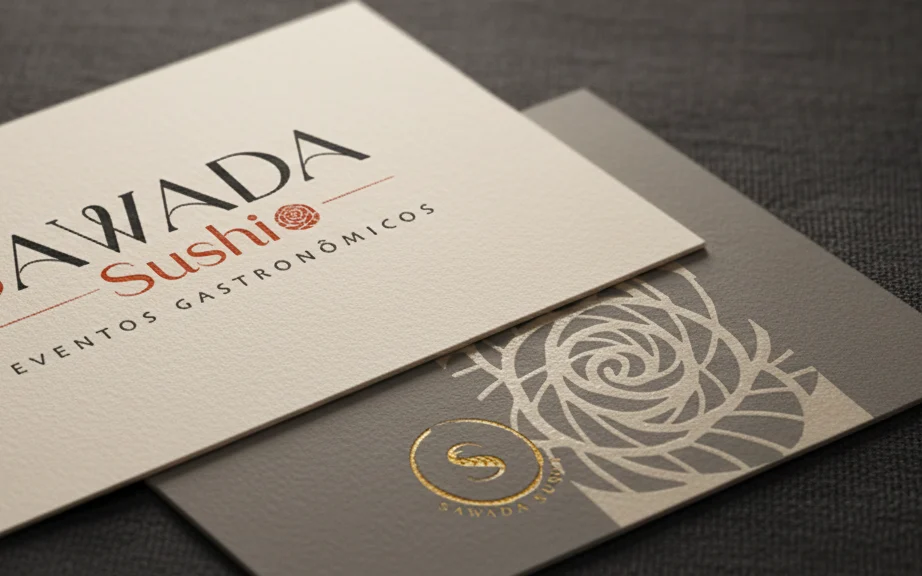
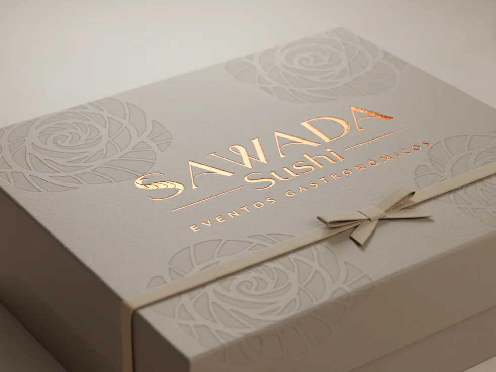
Touch: everything is embossed
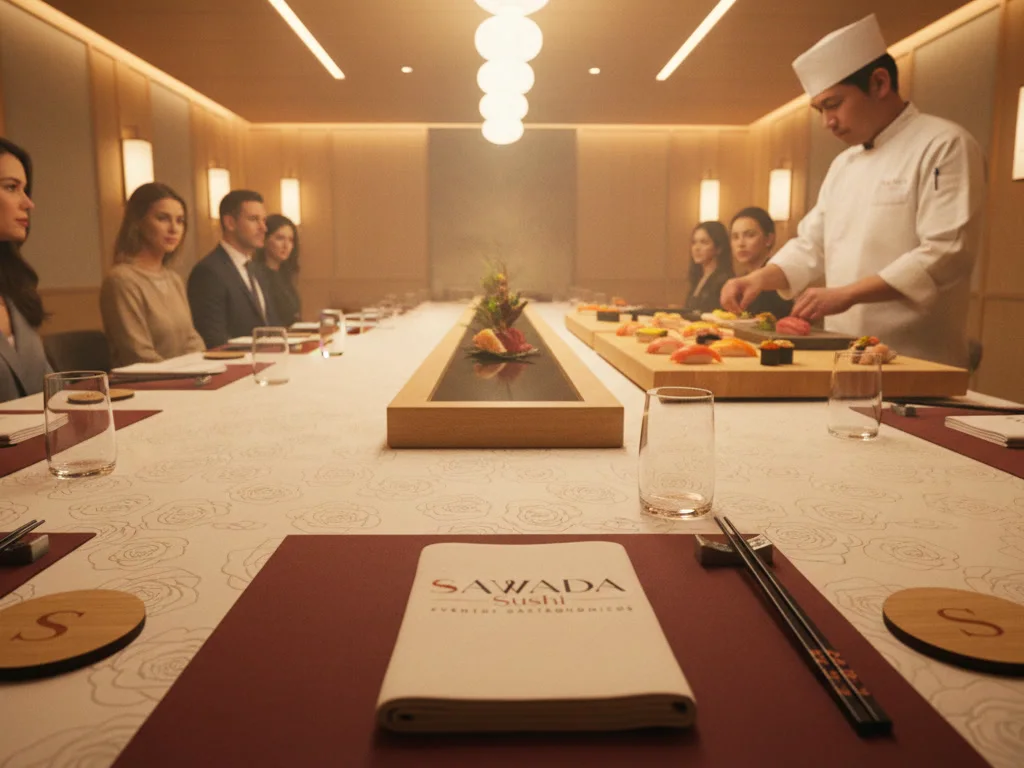
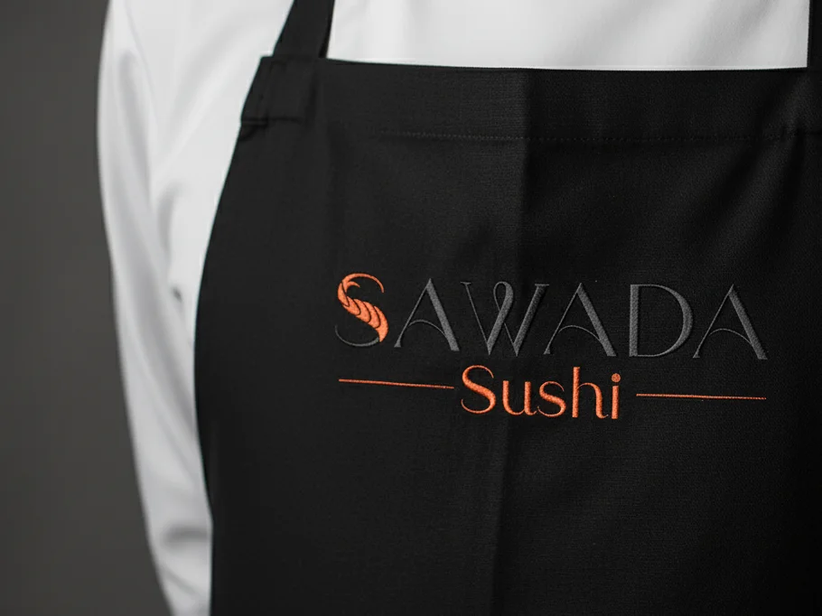
Blind embossing and spot varnish on the cards and menus, the rose as a pattern, the name embroidered on the apron. You feel the difference in your fingers before reading the name.
"The feeling I most want to convey is that the person is with someone there to serve them attentively, who cares about their tastes and listens to them. And to hit the sensory field of sight with a well-made, exotic presentation, and then the palate."
The chef, in the brand brief
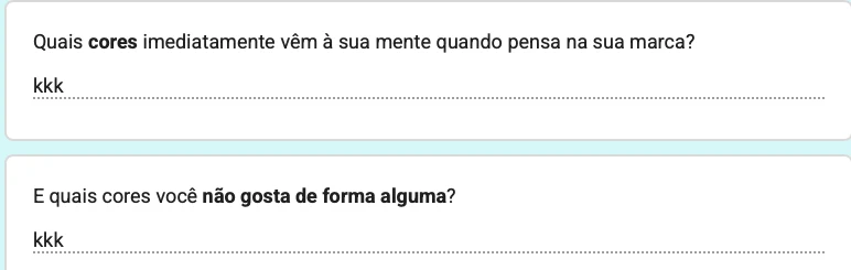
And a difficulty that changed everything: the chef knew what he wanted to make people feel, but couldn't explain colours. To the two questions about colour, he answered "kkk". He asked for a colourful yet sober palette, formal and welcoming. Because he is colour-blind.
A Japanese principle: in luxury, true sophistication is discreet and reveals itself to those who observe. We based the identity concept on it, with Sawada's audience in mind: people who look for exclusive experiences and expect sophistication. It guided every decision. Luxury doesn't need to shout to be noticed.
Every piece of the logo comes from the chef's work. Keep scrolling and watch the brand come together.
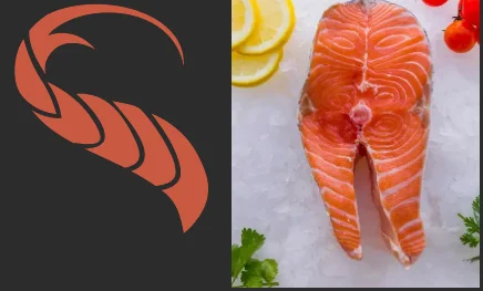
The fish and its cut, together in one letter. It's Gestalt: the eye sees the salmon before reading the S. The product and the art of the cut are right there in the first letter of the name.

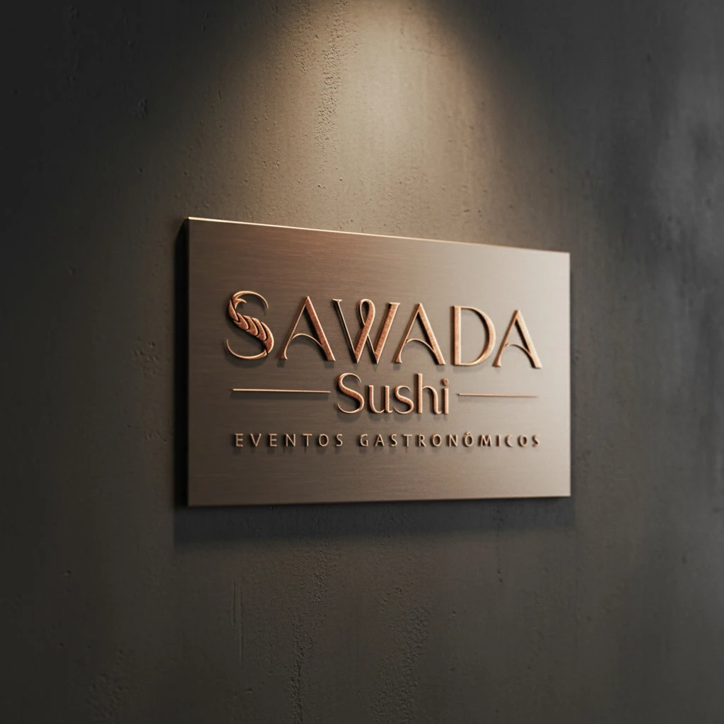
The chef chose Vivaldi as the brand's soundtrack. In the W is the baton that conducts the experience with precision: at the events, the chef is the conductor.
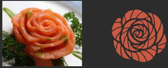
Look at the i in Sushi: the dot is a salmon rose, the "happiness through assembly" the chef asked for, said discreetly. Large, it becomes pattern, embossing and seal.
Alice asked the chef which colours he confuses and researched from there. One colour was left, a terracotta that he sees as it is. The rest is light and dark: the name in graphite on taupe has a contrast of 10 to 1.
Argue, a classic serif, brings the rigour of Vivaldi. Skia, discreet, brings easy reading and the contemporary side. All around, plenty of space: Shibui on paper.
Choose the background and the version. A good identity works on all of them.
#B63306#BF4D26#EADAC5#2C2C2CThe flavour and the spectacle of the sushi being made already belong to the chef. Alice's question was a different one: how does the brand make people feel that experience before the guest sees the sushi, and before tasting it?
Blind embossing and spot varnish on the cards and menus, the rose as a pattern, the name embroidered on the apron. You feel the difference in your fingers before reading the name.
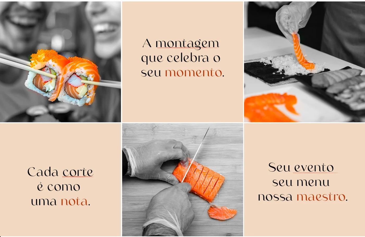
On social media, colour splash: the photographs stay black and white and only the salmon keeps its colour. The eye goes straight to the product. And the phrases follow the music: "Each cut is like a note."
Where guests touch the brand.
In under two minutes, the designer explains each choice in the brand: the brief, the salmon S, the baton, the rose and the colours.
“It turned out very well, beyond what I expected. With the new brand, I gained even more motivation to go after everything I want for my business to grow.”
A brand without a concept is just a pretty drawing, and pretty drawings are forgotten. Tell us what you do and for whom. We'll find the concept.
Start with the audit
Takes about 2 minutes.
Tell us what you need and where you want to get to. We study your business and prepare a free analysis: what is holding the business back and what to do first.
What you get, even if you don't go ahead with us